

In part one of this series, we talked about why companies need interactive analytics in order to unlock the full potential of their data.
Here, we’ll show you how our tool–Scuba–helps users interact with their data.
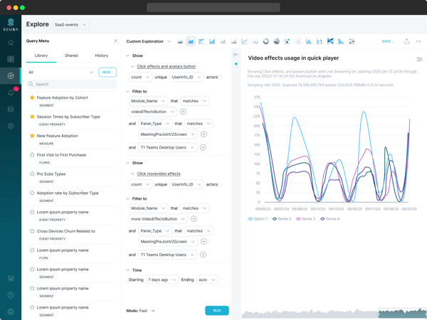
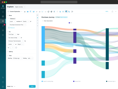
1. First off, Scuba has a single visual explorer to iterate over query definitions while visualizing results–all within a single screen, with no scrolling.
When you load up the explorer, Scuba runs a basic count of events over time for the last 7 days so you see a trend line right away.
You can point and click your way to splitting any dimension in your data, and you see all the dimensions via our typeahead. You can choose different metrics. You can interact with the chart itself to change the time range or filter series in or out, and your interactions update the query builder to help you learn to form queries.
This model is roughly similar to the Scuba tool our founders built at Facebook; The original Scuba model is used by over 50% of Facebook employees, including most people in product management and design.
This contrasts with analytic tools that have multiple pre-built query templates for particular types of queries, but no universal query builder, and whose query builder designs take up a full screen to form the query, then require scrolling to see results.
This tends toward running fewer queries and less experimentation. The pre-built templates may help new users get started, but figuring out what template to use when people start forming their own questions leads to a lot of cognitive overload and fatigue.
We’ve seen in the Facebook Scuba and our Scuba, universal visual explorer model that users, once hooked, use it more and more and drive more new insights for their businesses.
By contrast, the prescriptive template model gets an initial burst of enthusiasm, then usage wanes as people don’t learn anything new.
2. But this visual explorer wouldn't support interactivity if it wasn't married to a back end that delivers results fast.
That's where our technology's purpose-built behavioral query engine comes in. This isn't the post to get into its gory details, but what matters from a user experience perspective is that any query a user runs, even against the trillion-scale event data stores of our largest customers, returns in seconds. Users can experiment freely without waiting for each stage of their iteration to process slowly.
By contrast, the more prescriptive tools can often take minutes to process more complex parameters, and they direct you down certain paths for which they've been able to pre-optimize.
3. Another key element of Scuba's core visual explorer UX design that supports iteration is its breadcrumb trail.
This is a running list of all of your past queries in a session, with a button to return to that query instantly. That means that there's no risk of losing your way. If you try a filter or grouping that doesn't give you anything useful, you can just backtrack.
Beyond these main design elements, we are always looking for ways to better support exploration. For example, instead of a data dictionary with descriptions of attributes in a special separate area of the interface, Scuba has data tooltips that let users see descriptions and definitions inline while building and iterating on queries. Watch this space for many more developments coming this year to further our mission of facilitating data exploration.
Now, we will acknowledge that users do need a helping hand to get started. A new user confronting the visual explorer alone in a freshly deployed Scuba environment may not know what to do first.
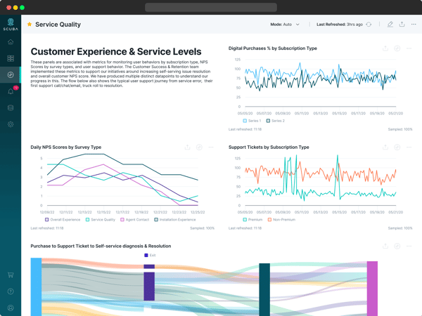
And, there are certain key metrics and reports in most businesses that let people know what's going on. That's where Scuba's living dashboards come in.
Any chart you build in the visual explorer can be pinned to a dashboard and shared with other users. An administrator can make a dashboard of a company's core metrics and trends the default landing page for their Scuba environment. Scuba's dashboards are "living" because users can explore from any dashboard chart into that same query in the visual explorer... from which their iterative journey can begin.
It's standard practice when we deploy Scuba for a customer to help them develop the right landing dashboard and underlying building blocks for their business.
We're now developing standardized content packs for common use cases as well.
With these, Scuba users get the best of both worlds: pre-built dashboard charts that give them a place to start, and an exploratory interface and performance that turn most tentative report consumers into active data explorers.
Think of our approach as training wheels on a fully capable bicycle that you can learn to ride anywhere–and others as a tricycle that will never go further than the end of your block.
